

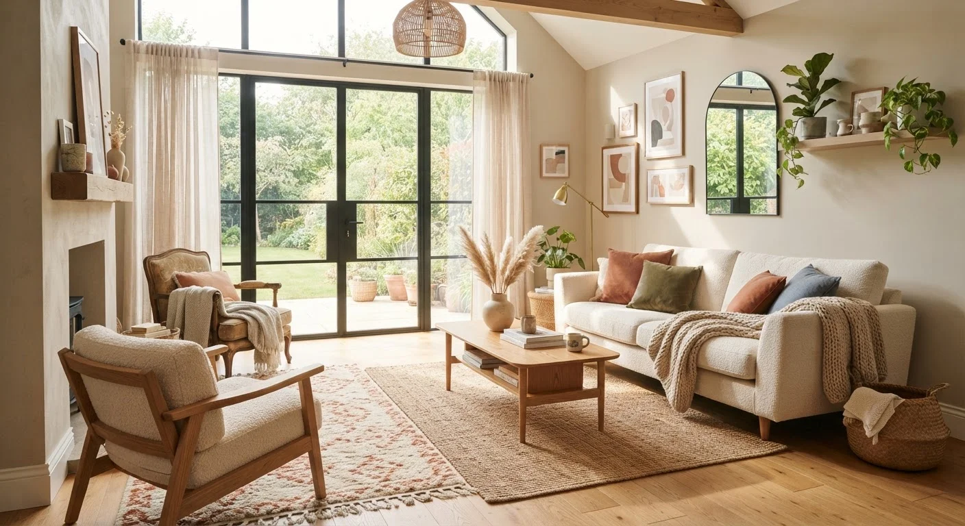
The Four Core Colour Scheme Types Explained
Walk into any paint store or design magazine and you'll encounter terms like monochromatic, complementary, analogous, and triadic. These aren't just jargon—each describes a specific way colours relate to one another on the colour wheel, and understanding them makes choosing a palette far less intimidating.
Monochromatic
A monochromatic scheme uses a single base colour in a range of tints (lighter versions), shades (darker versions), and saturations. Think a bedroom where the walls are soft sage, the bedding is a deeper forest green, and the cushions are a pale mint. It's cohesive and easy to get right.
Complementary
Complementary colours sit directly opposite each other on the colour wheel. Classic pairings include blue and orange, or purple and yellow. Used together, they generate contrast and visual energy. In most rooms, one colour should dominate while the other acts as a pop of accent.
Analogous
Analogous schemes pull from colours that sit adjacent on the colour wheel—say, blue, blue-green, and green. The result is naturally harmonious and calm, making it well-suited to bedrooms and living rooms where a relaxed atmosphere is the goal.
Triadic
A triadic scheme uses three colours evenly spaced around the colour wheel, such as red, yellow, and blue. It's vibrant and balanced but requires more confidence to pull off at home. Keeping two colours muted while letting the third pop is a reliable approach.
90%
Of snap judgments about products based on colour alone
Research published in the journal Management Decision suggests that up to 90% of initial product assessments can be influenced by colour, underscoring how strongly hue affects human perception.
60–30–10
Classic colour distribution ratio for interiors
Interior design professionals commonly recommend the 60-30-10 ratio as a starting framework for distributing colour across dominant surfaces, furniture, and accents in any room.
Applying a Colour Scheme Room by Room
Understanding the theory is one thing—applying it practically is another. A useful starting point is the 60-30-10 rule: roughly 60% of a room's colour comes from walls and large surfaces, 30% from furniture and major soft furnishings, and 10% from accessories and accent pieces. This ratio keeps a scheme from feeling overwhelming.
For open-plan spaces, choose a consistent undertone that runs across all areas even if the dominant hue shifts slightly. This creates visual flow without requiring every room to match exactly. Principles like balance and rhythm work hand-in-hand with colour choices to create spaces that feel considered rather than accidental.
In smaller rooms, lighter and more neutral analogous schemes can make a space feel more open. For more on that, see our guide on decorating compact rooms effectively.
Start With a Piece You Already Love
If choosing a full colour scheme feels daunting, begin with one item you already own—a rug, a piece of artwork, or a favourite cushion. Pull the two or three most prominent colours from it to build your scheme outward. This approach grounds your palette in something proven to work together and often produces more personal, cohesive results than starting from scratch.
Testing Colours Before You Commit
One of the most common mistakes homeowners make is choosing a paint colour solely from a small chip under shop lighting. A colour that looks like a perfect warm taupe on a card can appear unexpectedly pink or grey once applied to a full wall at home.
Paint a sample patch of at least 30cm × 30cm on the actual wall and observe it at different times of day—morning light, afternoon sun, and evening under your artificial lighting. Speaking of which, the type of bulb in your fixtures matters considerably. Our article on how lighting colour temperature shapes a room's mood explains why the same wall colour can look entirely different under warm and cool bulbs.
If you're not ready to repaint, experiment first with textiles, cushions, and artwork. These lower-commitment changes can give you a reliable sense of whether a colour direction suits your space before you invest in paint. For a handy reference on décor vocabulary you'll encounter as you plan, our home décor glossary covers terms from accent walls to vignettes.
Frequently Asked Questions
Monochromatic schemes are generally the easiest to start with because you're only working with one base hue. By varying the shade, tint, and saturation of a single colour across walls, textiles, and accents, you can build depth without the risk of clashing tones.
The 60-30-10 rule is a guideline suggesting you use a dominant colour for 60% of the room (typically walls), a secondary colour for 30% (furniture and larger soft furnishings), and an accent colour for the remaining 10% (accessories and décor). It helps maintain visual balance without making a scheme feel overwhelming.
Complementary colours sit directly opposite each other on the colour wheel—such as blue and orange, or green and red. Using them together creates strong visual contrast and energy. In home décor, one complementary colour typically dominates while the other appears as an accent to avoid an overwhelming effect.
Yes, mixing warm and cool tones is possible and can add visual interest, but it requires care. A common approach is to choose one temperature as dominant and use the other sparingly as an accent. Neutral shades like greige or off-white can bridge the two effectively.
Lighting dramatically changes how any paint colour appears. Natural daylight shows colours most accurately, while warm incandescent bulbs bring out yellow and red tones, and cool LED bulbs can shift colours toward blue. Always test paint samples on the actual wall under both natural and artificial light before committing.
Not necessarily. Soft furnishings, cushions, rugs, curtains, and artwork can shift the perceived colour palette of a room significantly. Swapping out these elements is a lower-cost way to test or update a colour scheme before committing to repainting.
The content on this site is for informational purposes only and is not a substitute for professional advice. Always consult a qualified professional for guidance specific to your situation.