

Why Décor Terminology Matters
Flip through a design magazine or scroll through a decorating blog and you'll quickly run into terms like juxtaposition, biophilic design, or sightline. Without a working vocabulary, it's easy to feel locked out of the conversation — or to misapply a concept and wonder why the result doesn't look quite right.
This glossary gives you a plain-language reference for the terms you're most likely to encounter when planning a room refresh, browsing inspiration boards, or talking with a designer. Pair it with our guide to core design principles to put these words into practice.
Accent Wall
A single wall in a room that is treated differently from the others — through paint, wallpaper, or texture — to draw the eye and add visual interest. It works best on a wall that is naturally prominent, such as the one behind a bed or sofa.
Vignette
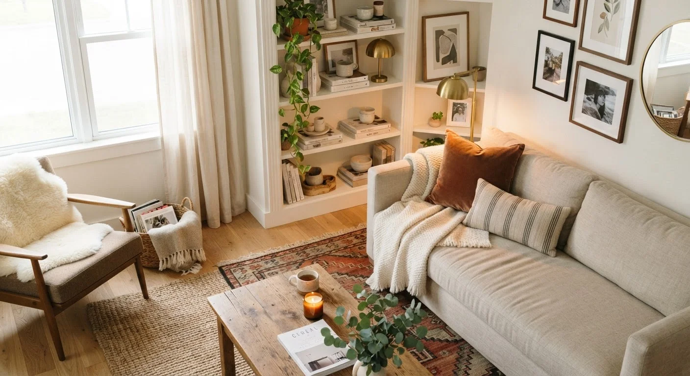
A small, intentionally arranged grouping of objects — such as a lamp, stack of books, and a plant — displayed together on a surface to tell a visual story. A well-composed vignette follows the principle of odd numbers and varying heights.
Scale
The size of furnishings and décor objects relative to the room and to each other. Proper scale means a sofa isn't overwhelmingly large for a small living room, or that artwork isn't too tiny to register on a tall wall.
Sightline
The natural path your eye travels when you look into or across a room. Designers use sightlines to decide where focal points should be placed and to ensure clutter doesn't interrupt the visual flow.
Negative Space
The intentionally empty or undecorated areas in a room that give the eye a place to rest. Leaving negative space prevents a room from feeling cluttered and allows key pieces to stand out.
Layering
The practice of adding depth and warmth by stacking or combining multiple textures, colours, or patterns — such as a flat woven rug under a sheepskin throw, topped with decorative pillows. Layering is central to making a space feel lived-in and complete.
Focal Point
The dominant visual anchor of a room — the element your eye is drawn to first. Common focal points include a fireplace, a large piece of artwork, or a statement piece of furniture. Every well-designed room typically has one clear focal point.
Biophilic Design
An approach that incorporates natural elements — plants, natural light, wood, stone, or water features — into interior spaces. Research in environmental psychology suggests connection to nature indoors can support wellbeing, though outcomes vary by individual and space.
Transitional Style
A decorating approach that blends traditional and contemporary elements, using classic shapes with updated finishes or neutral palettes. It tends to feel timeless rather than trend-dependent.
Traffic Flow
The way people physically move through a room. Good traffic flow means pathways between furniture are wide enough for comfortable passage — typically at least 36 inches for main walkways — without forcing awkward detours.
Warm vs. Cool Tones
Warm tones (reds, oranges, yellows, warm whites) tend to feel cozy and advancing, while cool tones (blues, greens, grays, crisp whites) feel calm and receding. Choosing between them shapes the perceived mood and even the apparent size of a room.
Juxtaposition
Placing contrasting elements side by side — rough beside smooth, old beside new, dark beside light — to create visual tension and interest. Deliberate juxtaposition is what makes a room feel curated rather than accidental.
Key Terms at a Glance
Use the quick-reference card below to orient yourself before diving into a decorating project. These figures and facts help frame realistic expectations when refreshing a space.
| Recommended artwork height | Center at roughly 57–60 inches from the floor (General interior design convention) |
| Minimum main walkway width | 36 inches for comfortable traffic flow (General interior design convention) |
| Rule of odds in vignettes | Group objects in sets of 3 or 5 for visual balance (Standard compositional design principle) |
| Rug size tip | All main furniture legs should touch or sit fully on the rug (General interior design convention) |
| Accent wall guidance | Limit to one wall per room to avoid visual competition (General interior design convention) |
| Lighting layers | Ambient, task, and accent — use all three in living spaces (General interior design convention) |
Once you're familiar with the foundational concepts, you'll find it much easier to evaluate what's working in a room and what needs attention. Our room-by-room décor refresh checklist is a natural next step — it helps you apply these terms room by room to spot what's dated or mismatched before you start spending.
If you're decorating a rental and want terminology that applies to removable solutions, see our companion piece on decorating a rental without losing your deposit. And for colour-specific vocabulary — monochromatic, complementary, triadic — our plain-language colour schemes guide goes deeper on hue, tone, and palette building.
Terminology Varies by Source
Design vocabulary isn't fully standardised — you may find the same concept described differently in various magazines, blogs, or professional contexts. For example, some sources use 'accent wall' and 'feature wall' interchangeably, while others draw a distinction. When working with a designer or contractor, it's always worth clarifying what a term means in that specific context to avoid misunderstandings.
The content on this site is for informational purposes only and is not a substitute for professional advice. Always consult a qualified professional for guidance specific to your situation.