

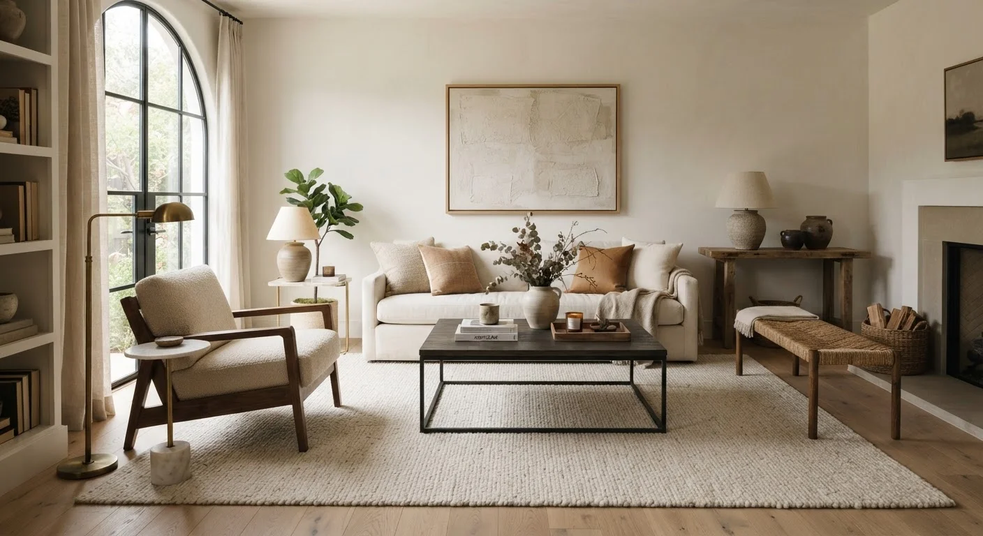
Why Design Principles Matter for Everyday Homeowners
Most people can sense when a room feels "off" but struggle to explain why. The answer usually lies in one or more violated design principles. Understanding these fundamentals doesn't require a design degree — it requires knowing what to look for and why it matters.
Design principles act as a shared visual language. They explain why a sofa pushed flat against a wall can make a room feel smaller, or why a single bold pillow can pull an entire color scheme together. Whether you're refreshing a single room or rethinking your whole home, these concepts give you a reliable framework to work within.
It's worth noting that principles are guides, not mandates. Rules are made to be broken — but it helps to understand them first. As you explore your decorating style, our article on minimalist vs. maximalist decorating can help you identify which approach fits your life and personality.
72%
Homeowners who say room layout affects daily mood
According to a survey by the American Institute of Architects, a strong majority of homeowners report that how a room is arranged influences how they feel in it day to day.
#1
Most common decorating regret: furniture scale
Interior design consultants frequently cite furniture that is too small for the space as the single most reported decorating regret among first-time homeowners.
Balance: Distributing Visual Weight
Balance is one of the most immediately felt principles in a room. A space feels balanced when the visual weight — the perceived heaviness of colors, sizes, and shapes — is distributed in a way that feels stable and intentional.
There are two main types:
- Symmetrical balance mirrors elements on either side of a central axis. Think matching nightstands flanking a bed or identical lamps on each end of a console table. It feels formal and orderly.
- Asymmetrical balance uses different objects of comparable visual weight to create equilibrium. A large sofa on one side might be balanced by a floor lamp plus an armchair on the other. It feels more relaxed and dynamic.
Neither type is superior — the right choice depends on the mood you want to create. Both achieve the same outcome: a room that doesn't feel lopsided.
Quick Balance Check for Any Room
Stand in the doorway of the room and squint slightly. If one side of the room appears dramatically heavier or darker than the other, you likely have a balance issue. Try redistributing furniture, adding a floor lamp to a lighter corner, or swapping in a larger area rug to ground the heavier side.
Scale and Proportion: Getting the Sizes Right
Scale refers to how the size of objects relates to the room itself and to each other. Proportion describes the size relationship between elements within a single piece or grouping.
A common misstep is buying a rug that's too small, causing furniture to float disconnectedly on bare floor. Ideally, the front legs of your main seating pieces should rest on the rug, anchoring the arrangement. Similarly, a small piece of artwork on a large wall can feel lost and afterthought-like.
When grouping decorative objects — on a shelf or console, for example — vary their heights to create visual interest while keeping the overall cluster proportionate to the surface it occupies. This connects directly to why indoor plants used as décor can either anchor or overwhelm a space depending on how their size relates to surrounding furniture.
Contrast and Rhythm: Keeping the Eye Engaged
Contrast prevents a room from feeling flat. It's created when two design elements differ meaningfully — in color (light vs. dark), texture (smooth vs. rough), or form (angular vs. curved). A room decorated entirely in the same tone and material may feel safe, but it rarely feels memorable. Our piece on when matching too much works against you explores exactly how over-coordination can drain life from a space.
Rhythm, by contrast, is about repetition with intention. Repeating a color in three different places — a throw pillow, a vase, an accent wall — gives the eye a consistent thread to follow. Rhythm can also be created through pattern, shape, or texture echoed across a room.
Together, contrast and rhythm create visual tension and resolution: the room holds your interest without overwhelming you. The same principles apply beyond interior spaces — designing outdoor living areas benefits from identical thinking around zones, contrast, and flow.
“Design is not just what it looks like and feels like. Design is how it works.”
— Steve Jobs, Co-founder of Apple, frequently cited in discussions of design philosophy
Frequently Asked Questions
No — you can start with just one or two. Focusing on scale and balance first usually yields the most immediate visual improvement. Layering additional principles over time is a practical and low-pressure approach.
Ignoring scale is among the most frequent errors — specifically, placing furniture that's too small for the room or hanging artwork too high. Both make a space feel disconnected and unfinished.
Contrast doesn't have to come from bold color differences. Mixing textures — smooth with rough, matte with glossy — or combining light and dark tones within the same color family creates visual interest without clashing.
Absolutely. In fact, small rooms benefit most from intentional application of scale and balance. Choosing appropriately sized furniture and maintaining clear visual pathways can make a compact space feel larger and more organized.
Visual weight refers to how heavy or substantial an object appears to the eye, regardless of its actual mass. Dark colors, large sizes, and dense textures carry more visual weight than light, small, or airy elements.
Rhythm emerges through repetition — using the same color in three different spots, repeating a geometric pattern in your rug and throw pillows, or echoing a curved shape in furniture across the room. It gives the eye a path to follow.
The content on this site is for informational purposes only and is not a substitute for professional advice. Always consult a qualified professional for guidance specific to your situation.