

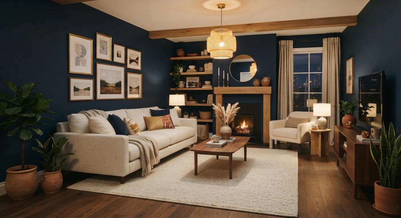
Where the Fear of Dark Paint Comes From
Decades of decorating advice centred on keeping walls pale — white, cream, or barely-there greige — as a reliable default for selling homes and pleasing the widest possible audience. That advice made practical sense for show homes and rental properties, but it left many homeowners unnecessarily nervous about exploring richer colour. The assumption that dark equals risky has stuck around long after the design world moved on.
Today, deep greens, inky blues, warm charcoals, and earthy reds are among the most widely used interior colours by both designers and everyday homeowners. Understanding why the old fears were overstated is the first step to making a confident decision for your own space. Before choosing, it also helps to have a grounding in colour scheme basics so you can see how a dark anchor colour fits with your furnishings and accents.
Busting the Most Common Dark-Paint Myths
The concerns homeowners raise about dark paint tend to cluster around the same handful of ideas: rooms will shrink, the colour can't be changed, or the result will feel gloomy. The myth-and-fact pairs below address each of these directly.
Myth
Dark paint will make my room feel like a cave.
Fact
Darkness alone doesn't shrink a room — poor lighting does. Dark colours actually add perceived depth, making walls feel like they recede rather than close in.
The cave effect comes from inadequate lighting, not paint colour. When you layer ambient, task, and accent lighting thoughtfully, dark walls absorb and frame that light rather than eliminating it. A well-lit room with charcoal or forest-green walls can feel just as open as a white one — and considerably more interesting. The key is ensuring you have enough light sources at varying heights.
Myth
Small rooms should never use dark colours.
Fact
Dark colours used consistently — walls, ceiling, and trim together — can make a small room feel intentional and immersive rather than cramped.
Painting all surfaces in the same deep tone, a technique sometimes called 'colour drenching,' eliminates the visual interruptions that actually make a room feel choppy and tight. When the eye isn't bouncing between contrasting colours, the space reads as a unified whole. Powder rooms, reading nooks, and hallways are excellent candidates for this approach.
Myth
You'll never be able to paint over a dark colour.
Fact
A quality primer designed for colour changes makes covering dark paint straightforward, typically requiring two coats of the new colour rather than one.
The idea that dark walls are permanent is one of the most persistent decorating myths. A tinted primer matched to your new colour dramatically reduces the number of finish coats needed. While going from navy to bright white takes more effort than switching between similar mid-tones, it is absolutely achievable as a DIY project with patience and the right materials.
Myth
Dark paint will fade quickly and look patchy within a year or two.
Fact
Modern paint formulations are highly durable; fading is caused more by direct UV exposure than by the depth of a colour.
Any paint colour — light or dark — will fade if exposed to strong, direct sunlight over time. Interior dark paints protected by window glazing typically hold their tone for many years. Choosing a paint with a higher resin content (usually labelled as 'durable' or 'scrubbable') also extends longevity significantly, regardless of colour depth.
Myth
Dark walls make a room feel cold and unwelcoming.
Fact
Warmth or coolness in a room is more about the undertone of the colour and the lighting used than the depth of the shade itself.
A deep terracotta, warm espresso, or forest-moss green can feel deeply cosy and inviting. Cooler darks like slate grey or blue-black read as more crisp and modern — a mood some homeowners actively prefer. As covered in our guide on how colour temperature shapes a room's mood, pairing warm-toned bulbs (2700K–3000K) with dark walls creates an especially enveloping, welcoming atmosphere.
Lighting decisions deserve particular attention. The quality, temperature, and placement of your bulbs interact directly with wall colour. See our detailed guide on warm vs. cool lighting for practical guidance on matching your light sources to your chosen shade.
Making Dark Colours Work in Your Home
Prep Work Makes or Breaks the Result
Whatever colour you choose, the quality of your paint job depends heavily on preparation. Skipping priming, sanding, or patching is the most common cause of disappointing results. See Interior Painting Prep: The Steps Most Homeowners Skip before you open a single tin.
A few practical principles help dark colours succeed in almost any room:
- Start with an accent wall if you're uncertain. One dark wall behind a sofa or bed gives you a sense of the colour's character without full commitment.
- Use satin or eggshell finishes rather than flat. These sheens allow the wall to catch and reflect light rather than absorbing it entirely.
- Keep trim light or match it to the wall — both approaches work, but for very different effects. Light trim creates definition; matching trim creates immersion.
- Layer your lighting. Table lamps, floor lamps, and sconces do more for a dark room than a single overhead fixture ever can.
2–3 coats
Typical coverage when painting over dark colours
Using a dedicated colour-change primer before applying a lighter finish coat typically reduces total coats needed compared to primer-free approaches.
2700K–3000K
Warm bulb range that best complements dark walls
Lighting professionals generally recommend bulbs in this colour temperature range to create a cosy, inviting atmosphere alongside deep or saturated wall colours.
Dark colours are not a shortcut to a moody mess — they're a tool that rewards a small amount of planning. With the right finish, lighting, and complementary furnishings, they can transform a flat, forgettable room into a space with genuine character.
The content on this site is for informational purposes only and is not a substitute for professional advice. Always consult a qualified professional for guidance specific to your situation.